
Latest News

Revolutionary AI-Powered EagleEye System: The Future of Military Technology Revealed!
The EagleEye system, developed by Anduril Industries, introduces a groundbreaking AI-powered technology aimed at enhancing situational awareness for military fo ...
Unbelievable Discovery: Dark Matter Could Color Light Red or Blue!
In a stunning revelation, researchers from the University of York have discovered that dark matter may subtly color light, potentially manifesting as red or blu ...
Unbelievable Discovery: Did Life's Building Blocks Arrive from Space?
Did you know that life’s building blocks might have arrived from space? New research shows that amino acids could survive the cosmic journey on interstellar d ...
Pixel 10 Pro Fold's Shocking Durability Test: Catches Fire?!
What happens when a highly anticipated smartphone bursts into flames during a durability test? That's exactly what YouTuber Zack Nelson discovered with Google's ...

NASA's GUARDIAN Could Give You Life-Saving Minutes Before a Tsunami Hits!
What if you could get advance warning about a tsunami, giving you precious minutes to escape? NASA's innovative GUARDIAN system is doing just that, detecting ts ...

China’s Shocking WTO Complaint: Is India’s EV Subsidy Scheme Unfair?
China's recent complaint to the WTO challenges India's subsidies for electric vehicles, claiming they give Indian industries an unfair advantage. With China dom ...
Ancient Dinosaur Superhighway Discovered: Shocking Footprints Found in UK Quarry!
The discovery of a massive dinosaur trackway in the Oxfordshire quarry has unearthed one of the world’s longest known dinosaur highways, stretching 220 meters ...
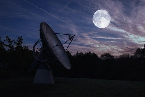
The Moon Economy: Are We Ready to Cash In on Lunar Resources?
The Moon economy is on the horizon as international space agencies prepare for the Artemis II mission in 2026. This ambitious venture aims to establish a perman ...
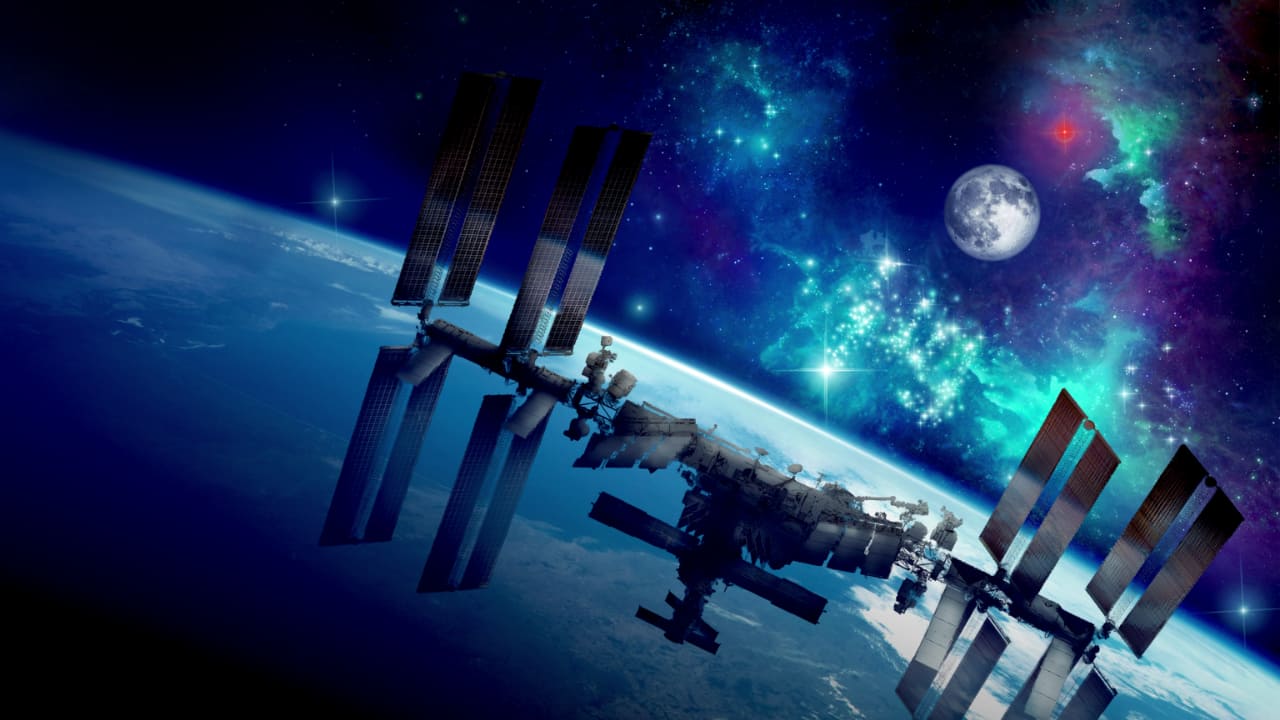
The End of an Era: What Will Happen When the ISS Falls from the Sky?
As the International Space Station prepares for retirement in 2030, its legacy of over 25 years of continuous human presence in space will be hard to match. Thi ...
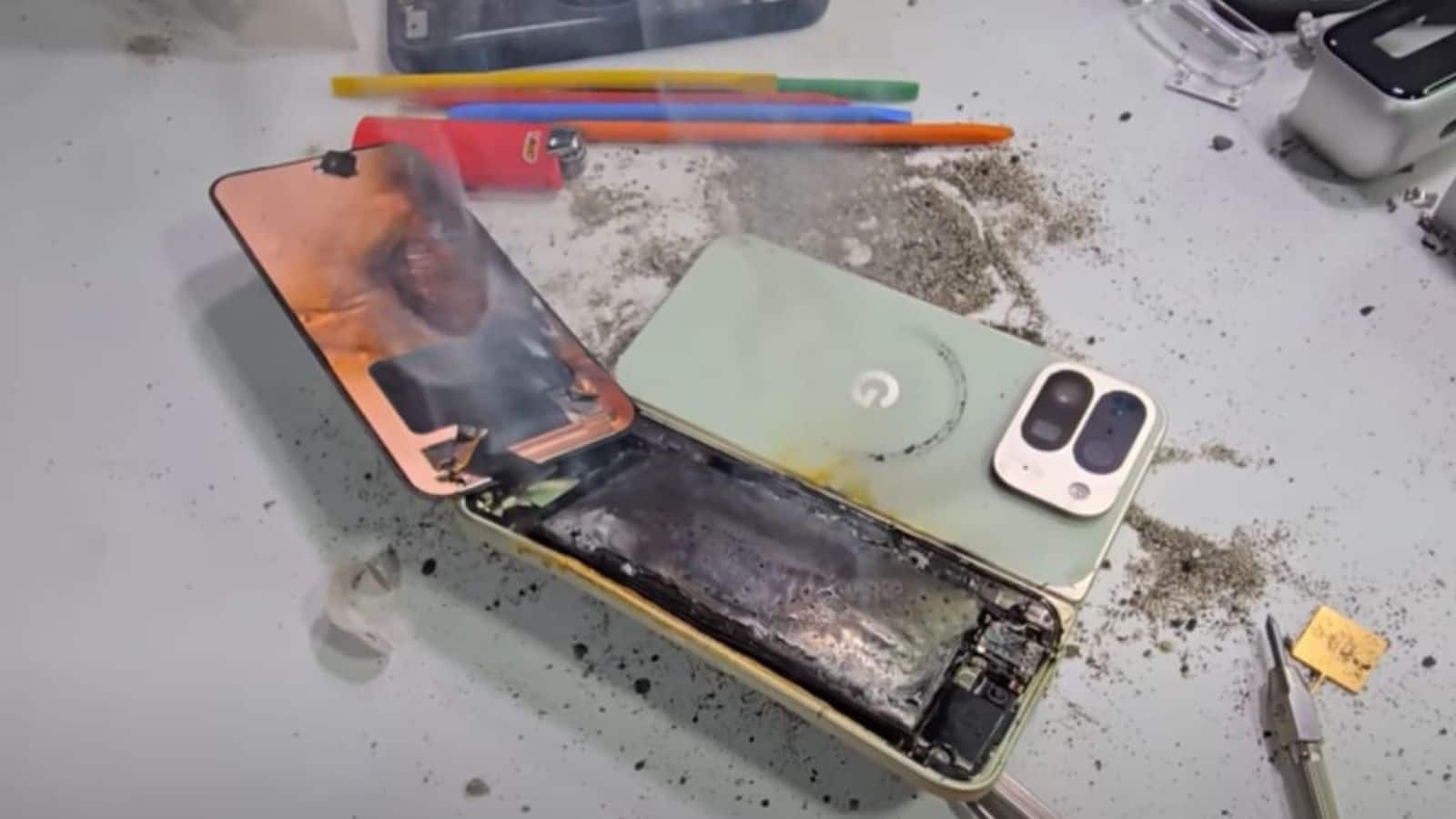
Unbelievable Battery Explosion: Is the Google Pixel 10 Pro Fold Safe?
The shocking explosion of the Google Pixel 10 Pro Fold's battery during a durability test by JerryRigEverything has raised serious safety concerns. While some d ...
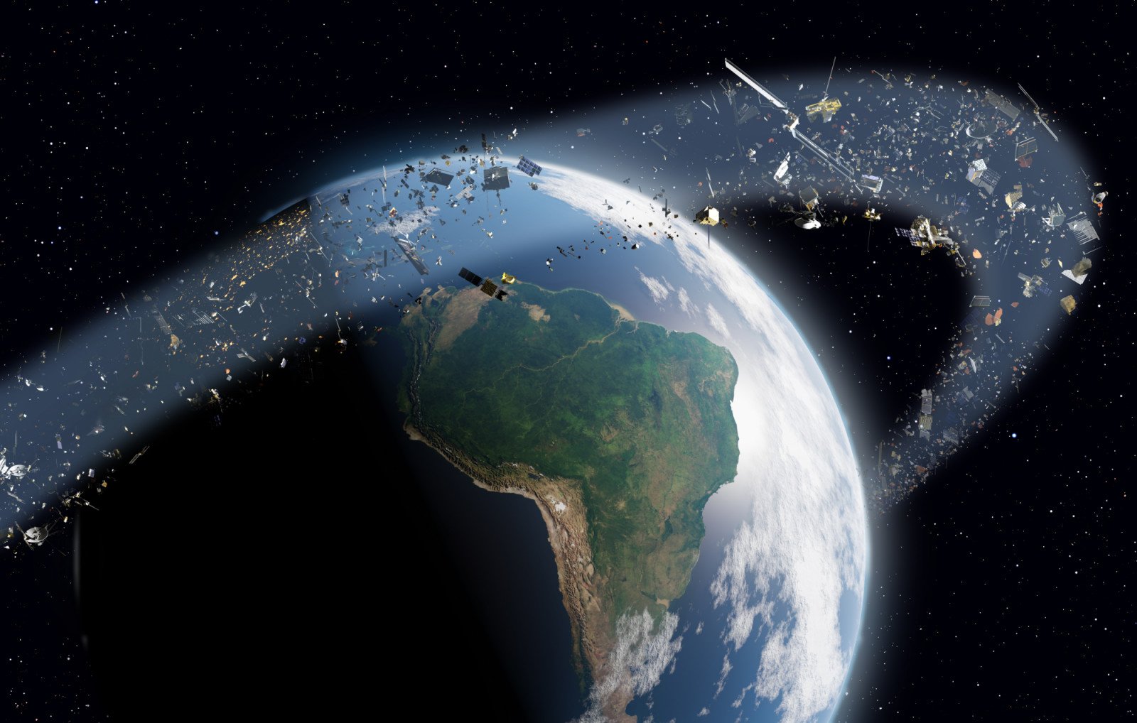
Is Earth’s Orbit Becoming a Dangerous Junkyard? Shocking Truth Revealed!
Is Earth’s orbit on the brink of becoming a hazardous junkyard? With over 1.2 million pieces of debris circulating our planet, experts are ringing alarm bells ...
Amazon's Shocking Layoff Plans: 15% of HR Jobs to Disappear Amid AI Shift!
Amazon is set to lay off 15% of its HR staff as part of a major strategic shift towards automation. This move comes as the company invests heavily in AI technol ...

China's Trade Threats: Are Allies Like India Ready to Support the U.S.?
In the face of rising trade tensions, U.S. Treasury Secretary Scott Bessent declared a battle between China and the world, emphasizing the need for allied suppo ...
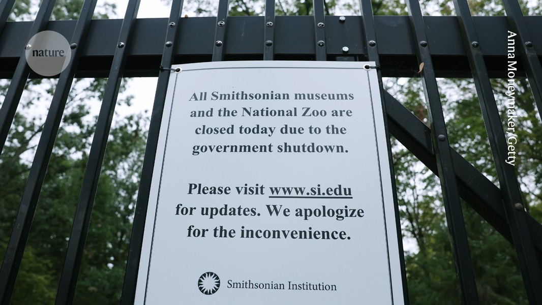
Unbelievable Impact: US Government Shutdown Threatens Science and Health!
The ongoing US government shutdown is wreaking havoc on science and public health, leading to massive layoffs and funding cuts. With critical programs like the ...

Shocking Currency Shifts: Why a Weaker Dollar Could Change Everything!
Did you know the U.S. dollar is plunging to multi-month lows as global currencies rise? Fed Chair Jerome Powell's hints at rate cuts have reshaped the market la ...
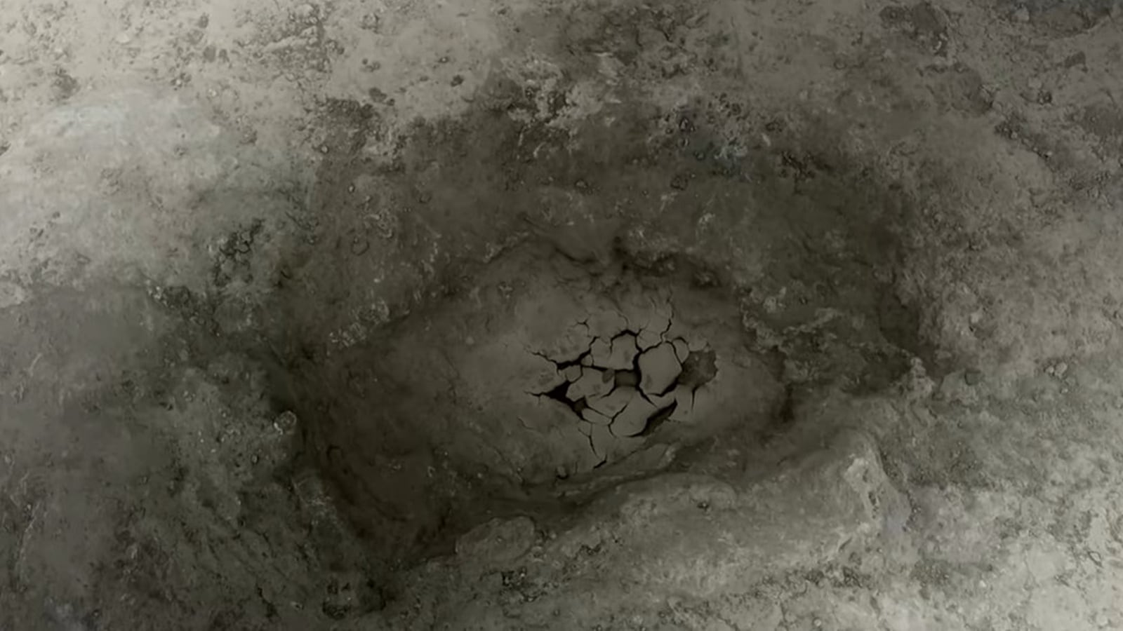
Shocking Discovery: Chicago's Viral 'Rat Hole' Is Actually a Squirrel's Creation!
Think you know everything about Chicago's viral 'Rat Hole'? Think again! A new study reveals that this infamous sidewalk imprint, which thousands flocked to vis ...
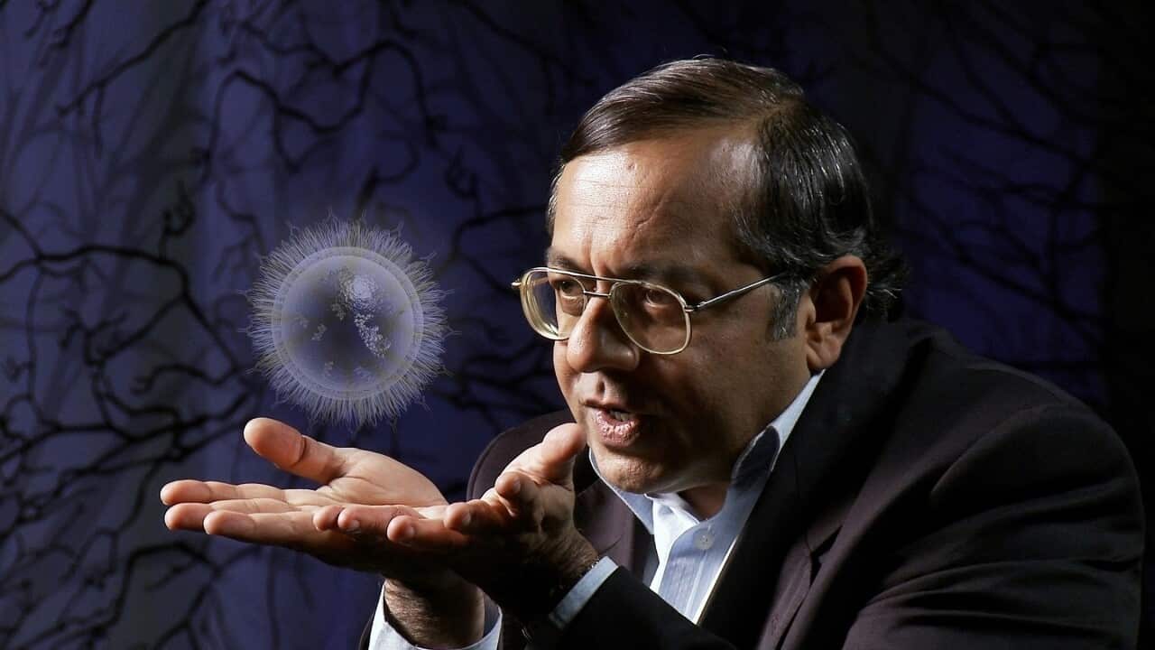
Unbelievable Breakthrough: Aussie Scientists Battle Decades to Transform Cancer Treatment!
Prepare to be inspired by the incredible journey of Dr. Jennifer MacDiarmid and Dr. Himanshu Brahmbhatt, two Australian scientists making waves in the fight aga ...

Unbelievable $15 Billion Scam: Romance, Forced Labor, and a Mysterious Kingpin!
In a jaw-dropping revelation, federal prosecutors have seized a staggering $15 billion from Chen Zhi, the mastermind behind a massive scam that exploited victim ...

Unbelievable Irony: U.S. Wants India’s Help While Slapping Tariffs on Their Goods!
In a bizarre twist of diplomacy, the U.S. is demanding support from India against China's dominance in the rare earth market while simultaneously enforcing stee ...
Google's Foldable Phone EXPLODES in Shocking Durability Test!
In a shocking turn of events, Google's Pixel 10 Pro Fold has failed dramatically in a durability test, exploding during testing. YouTuber JerryRigEverything hig ...

Unbelievable Discovery: Explosive Volcanic Eruptions Might Have Hidden Ice on Mars!
Did you know that explosive volcanic eruptions may have hidden ice in Mars's equatorial regions? A recent study in Nature Communications suggests that these pas ...

Tens of Billions Stolen: Massive Crackdown on Global Scam Empire Unveiled!
Authorities have launched a groundbreaking offensive against a vast criminal organization linked to a staggering $15 billion in scams, revealing a dark web of h ...

YouTube's Shocking Auto-Dubbing Feature: Are You Ready for Lip-Synced Content in Your Language?
YouTube is revolutionizing how we engage with video content through its innovative auto-dubbing feature, which offers lip-synced translations in multiple langua ...

Flat Earth Believers Shocked! A Simple Experiment Proves Our World is Round
Flat Earth theorists are facing a major blow as a simple Reddit experiment reveals the Earth’s roundness. A stunning time-lapse captures the analemma, a figur ...

Jerome Powell’s Shocking Warning: Is the Job Market in Danger?
Jerome Powell’s recent speech at the NABE conference has raised alarms about the precarious state of the US job market amid rising inflation risks. He emphasi ...

Shocking Discovery: Can Yeast Survive Mars-Like Conditions?
Can yeast survive the Martian environment? A fascinating study reveals that Saccharomyces cerevisiae can endure extreme conditions resembling those on Mars, tha ...
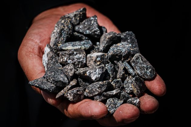
China's Shocking New Rules on Rare Earth Exports Could Cripple Global Tech!
In a stunning turn of events, China has tightened export restrictions on rare earth minerals vital for electric vehicles and technology, causing chaos in the U. ...

Elon Musk's Starship: Unbelievable Milestone in Space Travel Revealed!
SpaceX’s Starship has pushed the limits of space exploration with its recent test flight, making history by successfully hovering and splashing down in the Gu ...

Trapped in Flames: Shocking Death of Driver in Electric Car Crash Sparks Outrage!
In a chilling incident in Chengdu, China, a driver tragically died after being trapped in a burning electric vehicle following a high-speed crash. The Xiaomi SU ...
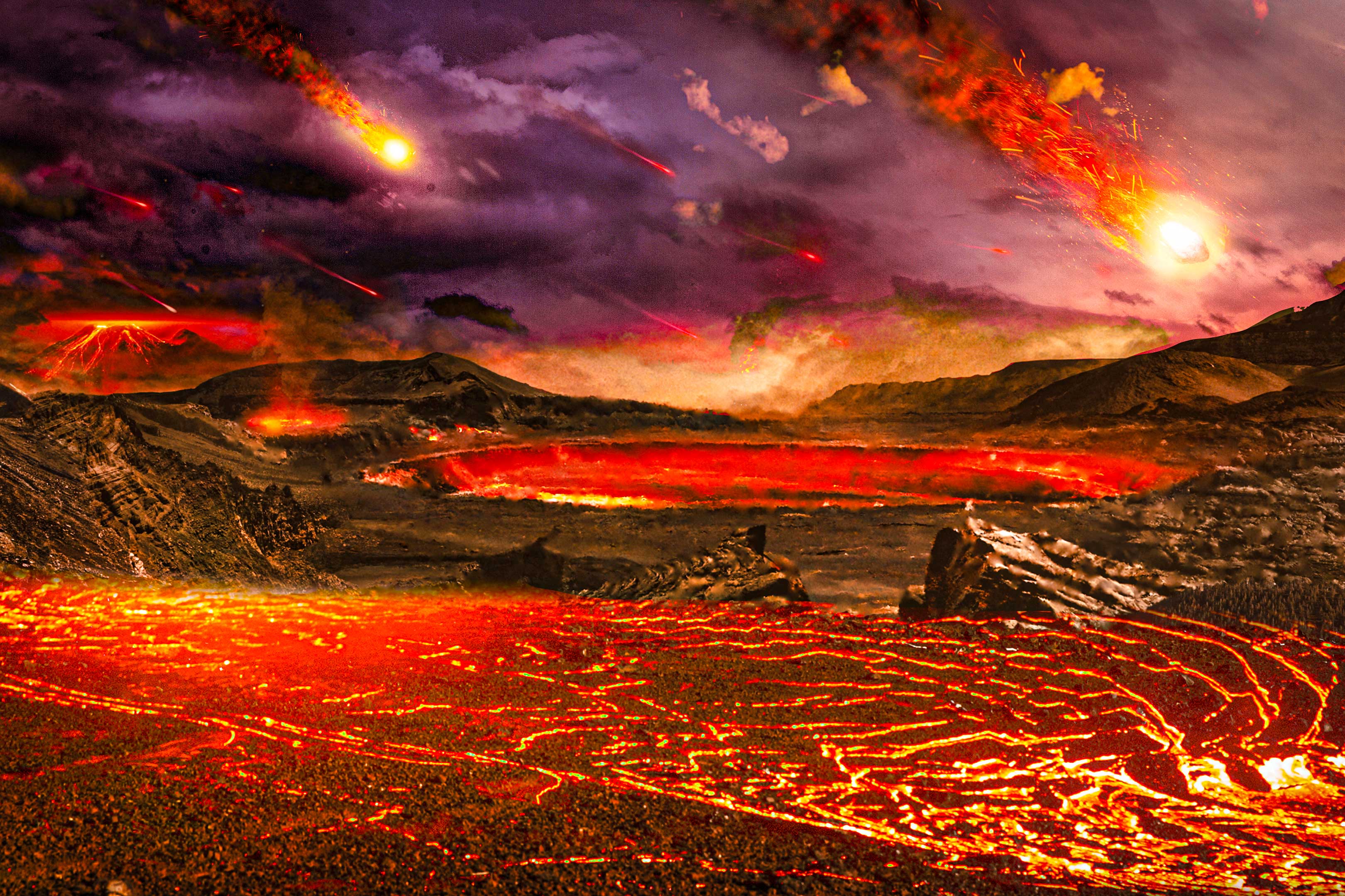
Unbelievable Discovery: Scientists Find Ancient Remnants of Proto Earth!
Scientists at MIT have made a stunning discovery: remnants of the proto Earth, dating back 4.5 billion years, have been found, shedding light on the planet's or ...

Massive Data Breach Exposes Millions: Is Your Information at Risk?
In a shocking revelation, Vietnam Airlines has confirmed a massive data breach affecting 23 million customer records, linked to a global tech partner. The airli ...

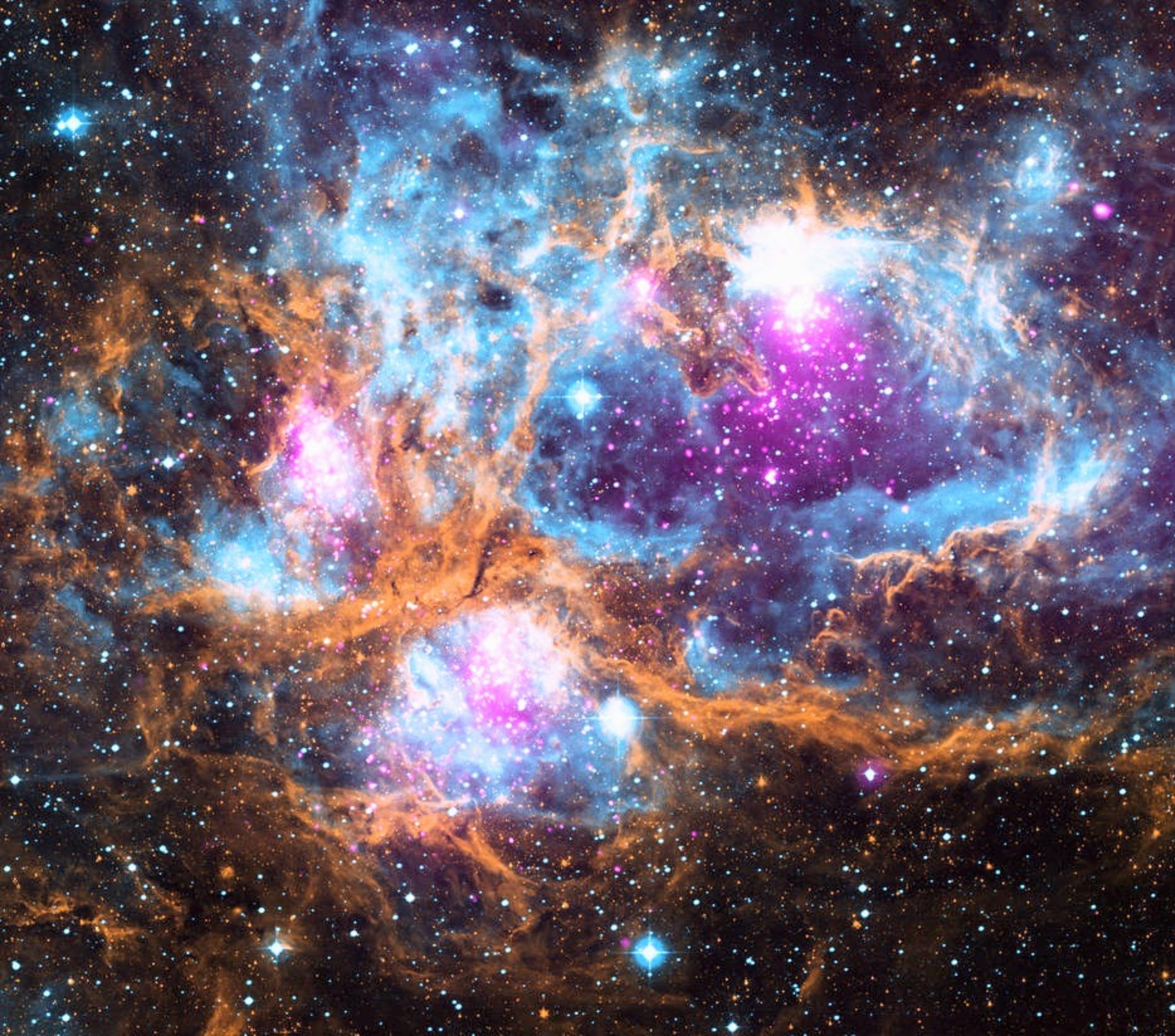
Shocking Proof of Black Hole Pairs Found: Is the Universe Hiding More Secrets?
Prepare to have your mind blown: astronomers have captured an image of two black holes orbiting each other, confirming that black hole pairs are real! This disc ...

Meet Ubo Pod: The AI Assistant That Puts Your Privacy First!
Have you ever wanted a smart assistant that respects your privacy? Introducing Ubo Pod, a customizable, open-source AI assistant designed to run privately witho ...
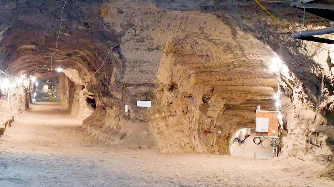
Unbelievable: 40,000-Year-Old Microbes Brought Back to Life in Alaskan Permafrost!
Researchers have astonishingly revived ancient microbes that lay frozen in Alaskan permafrost for 40,000 years! Collected from a military tunnel, these microbes ...

Unbelievable Links: Elon Musk's Starlink Allegedly Fuels Global Scams!
It’s shocking to think that a service designed to connect the world might also be enabling crime. A bipartisan congressional committee in the U.S. is investig ...
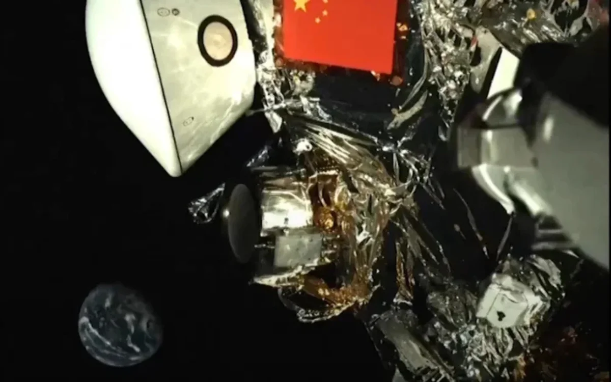
Earth Looks Tiny in Stunning Selfie Captured by China’s Space Probe!
China’s Tianwen-2 space probe just captured a jaw-dropping selfie of Earth from 43 million kilometers away, reminding us how small our planet is in the univer ...

Unbelievable Breakthrough: This Tiny Molecule Could Revolutionize Cancer Treatment!
Imagine a world where cancer treatment is not only effective but also affordable! A groundbreaking study from researchers at the University of Hawaiʻi at Māno ...

Gold Soars Past $4,100: Is a $5,000 Price Tag Next?
Gold has hit an all-time high, surpassing $4,100 an ounce amidst renewed US-China trade tensions and expected interest rate cuts. With analysts predicting price ...

Shocking Discovery: Microplastics Are Threatening Earth's Carbon Sequester Champions!
Did you know that tiny Antarctic krill aren't just food for marine life, but also vital carbon sequesters? Recent studies show that they play a crucial role in ...
News by Category
Revolutionary AI-Powered EagleEye System: The Future of Military Technology Revealed!
The EagleEye system, developed by Anduril Industries, introduces a groundbreaking AI-powered technology aimed at enhancing situational awareness for military fo ...
China’s Shocking WTO Complaint: Is India’s EV Subsidy Scheme Unfair?
China's recent complaint to the WTO challenges India's subsidies for electric vehicles, claiming they give Indian industries an unfair advantage. With China dom ...
Amazon's Shocking Layoff Plans: 15% of HR Jobs to Disappear Amid AI Shift!
Amazon is set to lay off 15% of its HR staff as part of a major strategic shift towards automation. This move comes as the company invests heavily in AI technol ...

The Shocking Truth Behind the Internet's Favorite 'Rat Hole' Revealed!
In a surprising turn of events, the viral 'Chicago Rat Hole'—thought to be a rat impression—has been identified as the result of a squirrel's jump gone wron ...
Unbelievable Discovery: Dark Matter Could Color Light Red or Blue!
In a stunning revelation, researchers from the University of York have discovered that dark matter may subtly color light, potentially manifesting as red or blu ...
Unbelievable Discovery: Did Life's Building Blocks Arrive from Space?
Did you know that life’s building blocks might have arrived from space? New research shows that amino acids could survive the cosmic journey on interstellar d ...
Pixel 10 Pro Fold's Shocking Durability Test: Catches Fire?!
What happens when a highly anticipated smartphone bursts into flames during a durability test? That's exactly what YouTuber Zack Nelson discovered with Google's ...
The Moon Economy: Are We Ready to Cash In on Lunar Resources?
The Moon economy is on the horizon as international space agencies prepare for the Artemis II mission in 2026. This ambitious venture aims to establish a perman ...
Unbelievable Battery Explosion: Is the Google Pixel 10 Pro Fold Safe?
The shocking explosion of the Google Pixel 10 Pro Fold's battery during a durability test by JerryRigEverything has raised serious safety concerns. While some d ...